
Very nice work. It feels "warmer" than what I've seen of Youll's work on the series.
Dune Art
Moderators: Freakzilla, ᴶᵛᵀᴬ, Omphalos
-
Tleszer

- Posts: 2161
- Joined: 17 Feb 2008 18:02
Re: Dune Art
Very nice work. It feels "warmer" than what I've seen of Youll's work on the series.
DUNE, as interpreted by a blue man with a green tushie
-
Omphalos

- Inglorious Bastard
- Posts: 6677
- Joined: 05 Feb 2008 11:07
- Location: The Mighty Central Valley of California
- Contact:
Re: Dune Art
Nice. Shoot him a link to the Dune font.

-
SandChigger

- KJASF Ground Zero
- Posts: 14492
- Joined: 08 Feb 2008 22:29
- Location: A continuing state of irritation
- Contact:
Re: Dune Art
Ahp, nice, but what's that about shield walls? 
-
Redstar

- Posts: 1202
- Joined: 25 Feb 2009 04:13
Re: Dune Art
Done! He didn't realize there was a font, but said he probably would have gone with what he did on his own anyways to change it up a little bit.Omphalos wrote:Nice. Shoot him a link to the Dune font.
I made a comment of being wary of the sandworm so close to the refinery and explained the shield walls and Arrakeen a little bit and how all that's important to the story as he hadn't read the book. Don't think it influenced the final design too much.SandChigger wrote:Ahp, nice, but what's that about shield walls?
-
SandChigger
- KJASF Ground Zero
- Posts: 14492
- Joined: 08 Feb 2008 22:29
- Location: A continuing state of irritation
- Contact:
Re: Dune Art
OK. But just to be clear, it's Shield Wall, singular, as the name (capitalized) of a geographical feature. 
That's why I was confused... "shield walls" sounds like walls composed of shields... which would draw the worms if out on the open bled. Beyond the Shield Wall.
That's why I was confused... "shield walls" sounds like walls composed of shields... which would draw the worms if out on the open bled. Beyond the Shield Wall.
"Let the dead give water to the dead. As for me, it's NO MORE FUCKING TEARS!"
-
Redstar
- Posts: 1202
- Joined: 25 Feb 2009 04:13
Re: Dune Art
Right. I made a point to define the Shield Wall as a geographic occurrence, but he didn't seem interested enough to differentiate. I just went with his terminology over there to keep things consistent, although it's obviously wrong over here. 
-
DuneFishUK

- Posts: 1991
- Joined: 25 May 2008 14:14
- Location: Cool Britannia
- Contact:
Re: Dune Art
I like the current font - it's rather nice. Reminds me a little bit of the current Great Dune Trilogy cover... could just be the colour though.Redstar wrote:Done! He didn't realize there was a font, but said he probably would have gone with what he did on his own anyways to change it up a little bit.Omphalos wrote:Nice. Shoot him a link to the Dune font.
(I wrote up a list of some of the official Dune Fonts here - http://www.kullwahad.com/?p=257" onclick="window.open(this.href);return false; )
- http://www.kullwahad.com" onclick="window.open(this.href);return false; - http://dunefont.kullwahad.com" onclick="window.open(this.href);return false; -
-
Freakzilla

- Lead Singer and Driver of the Winnebego
- Posts: 18484
- Joined: 05 Feb 2008 01:27
- Location: Atlanta, Georgia, USA
- Contact:
Re: Dune Art
I found these very interesting!

Chani by waspwolfshark, on Flickr
http://www.flickr.com/photos/48244287@N ... 810871895/" onclick="window.open(this.href);return false;
Chani by waspwolfshark, on Flickr
http://www.flickr.com/photos/48244287@N ... 810871895/" onclick="window.open(this.href);return false;

Paul of Dune was so bad it gave me a seizure that dislocated both of my shoulders and prolapsed my anus.
~Pink Snowman
-
SandRider

- Watermaster
- Posts: 6163
- Joined: 05 Oct 2008 16:14
- Location: In the back of your mind. Always.
- Contact:
Re: Dune Art
wow, yeah, really interesting ... all his stuff ...and in my mind, the discussion of what Duncan Idaho looks like is over ...
................ I exist only to amuse myself ................


I personally feel that this message board, Jacurutu, is full of hateful folks who don't know
how to fully interact with people. ~ "Spice Grandson" (Bryon Merrit) 08 June 2008
I personally feel that this message board, Jacurutu, is full of hateful folks who don't know
how to fully interact with people. ~ "Spice Grandson" (Bryon Merrit) 08 June 2008
-
merkin muffley

- Posts: 1584
- Joined: 23 Apr 2010 15:18
- Location: War Room
Re: Dune Art
I like those a lot. Duncan's very good, and I like the take on Hwi.
-
Redstar
- Posts: 1202
- Joined: 25 Feb 2009 04:13
Re: Dune Art
Great artwork. So refreshing to see a more cartoony take on the characters, though of course its not too cartoony. I can see that style working well in vintage advertisements. The coloring-style is perhaps what makes them all stand out the most.
-
SadisticCynic
- Posts: 2053
- Joined: 07 Apr 2009 09:28
- Location: In Time or in Space?
Re: Dune Art
Not my favourite style of drawing, but I like these; they evoke the scenes they are set in very well.
Ah English, the language where pretty much any word can have any meaning! - A Thing of Eternity
-
Freakzilla
- Lead Singer and Driver of the Winnebego
- Posts: 18484
- Joined: 05 Feb 2008 01:27
- Location: Atlanta, Georgia, USA
- Contact:
Re: Dune Art

Paul of Dune was so bad it gave me a seizure that dislocated both of my shoulders and prolapsed my anus.
~Pink Snowman
-
Redstar
- Posts: 1202
- Joined: 25 Feb 2009 04:13
Re: Dune Art
That one's a cute under-representation of their rivalry. 
-
Freakzilla
- Lead Singer and Driver of the Winnebego
- Posts: 18484
- Joined: 05 Feb 2008 01:27
- Location: Atlanta, Georgia, USA
- Contact:
Re: Dune Art
If the RM was saying "whore" it'd be perfect.
Paul of Dune was so bad it gave me a seizure that dislocated both of my shoulders and prolapsed my anus.
~Pink Snowman
-
Redstar
- Posts: 1202
- Joined: 25 Feb 2009 04:13
Re: Dune Art
Exactly! "Skank" is such a teenage term it makes the picture so comical.Freakzilla wrote:If the RM was saying "whore" it'd be perfect.
-
SandRider
- Watermaster
- Posts: 6163
- Joined: 05 Oct 2008 16:14
- Location: In the back of your mind. Always.
- Contact:
Re: Dune Art
I'd like to see a collaboration of many, many artists do the complete series ... and switch back and forth, maybe each chapter,
maybe just randomly, in the middle of a scene, whatever ... some ActionComics style, the new "dark" stuff like Frank Miller,
this kid's Erin e-Surance stuff, whatever it is that Simon does, and so on .....
but ...
Wish in One Hand,
the HLP will Shit in the Other ...
maybe just randomly, in the middle of a scene, whatever ... some ActionComics style, the new "dark" stuff like Frank Miller,
this kid's Erin e-Surance stuff, whatever it is that Simon does, and so on .....
but ...
Wish in One Hand,
the HLP will Shit in the Other ...
................ I exist only to amuse myself ................
I personally feel that this message board, Jacurutu, is full of hateful folks who don't know
how to fully interact with people. ~ "Spice Grandson" (Bryon Merrit) 08 June 2008
I personally feel that this message board, Jacurutu, is full of hateful folks who don't know
how to fully interact with people. ~ "Spice Grandson" (Bryon Merrit) 08 June 2008
-
RedHeadKevin
- Posts: 66
- Joined: 13 Feb 2009 19:45
Re: Dune Art
That BG/HM fighting picture should have the BG saying "whore," and the HM saying "witch."
Honestly, I really like the style in those pictures. While I often prefer something a little more realistic for "What Dune Should Look Like," these give a great impression of the visuals, but still leave it slightly open to interpretation. They're a good starting point to help folks visualize the characters.
Honestly, I really like the style in those pictures. While I often prefer something a little more realistic for "What Dune Should Look Like," these give a great impression of the visuals, but still leave it slightly open to interpretation. They're a good starting point to help folks visualize the characters.
I don't recommend anyone drink their thigh pad water. It tastes really bad, like ass and dirt.
-
Freakzilla
- Lead Singer and Driver of the Winnebego
- Posts: 18484
- Joined: 05 Feb 2008 01:27
- Location: Atlanta, Georgia, USA
- Contact:
Re: Dune Art
http://projectsand.blogspot.com/" onclick="window.open(this.href);return false;
Paul of Dune was so bad it gave me a seizure that dislocated both of my shoulders and prolapsed my anus.
~Pink Snowman
-
Freakzilla
- Lead Singer and Driver of the Winnebego
- Posts: 18484
- Joined: 05 Feb 2008 01:27
- Location: Atlanta, Georgia, USA
- Contact:
Re: Dune Art
Leto II:
http://2.bp.blogspot.com/_mNqO_IGx3Bg/T ... 2y7h2s.jpg" onclick="window.open(this.href);return false;
http://2.bp.blogspot.com/_mNqO_IGx3Bg/T ... 2y7h2s.jpg" onclick="window.open(this.href);return false;
Paul of Dune was so bad it gave me a seizure that dislocated both of my shoulders and prolapsed my anus.
~Pink Snowman
-
Freakzilla
- Lead Singer and Driver of the Winnebego
- Posts: 18484
- Joined: 05 Feb 2008 01:27
- Location: Atlanta, Georgia, USA
- Contact:
Re: Dune Art
Paul of Dune was so bad it gave me a seizure that dislocated both of my shoulders and prolapsed my anus.
~Pink Snowman
-
Freakzilla
- Lead Singer and Driver of the Winnebego
- Posts: 18484
- Joined: 05 Feb 2008 01:27
- Location: Atlanta, Georgia, USA
- Contact:
Re: Dune Art
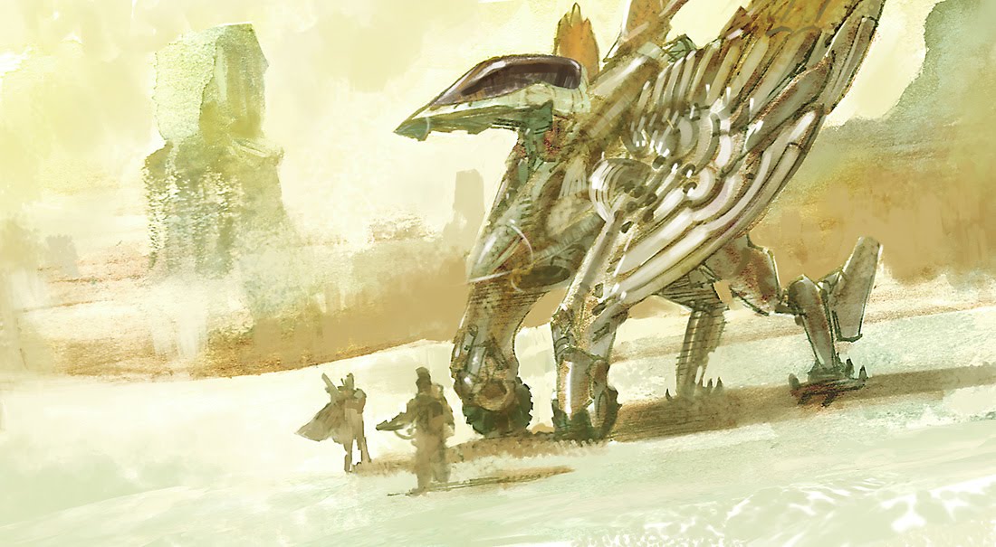
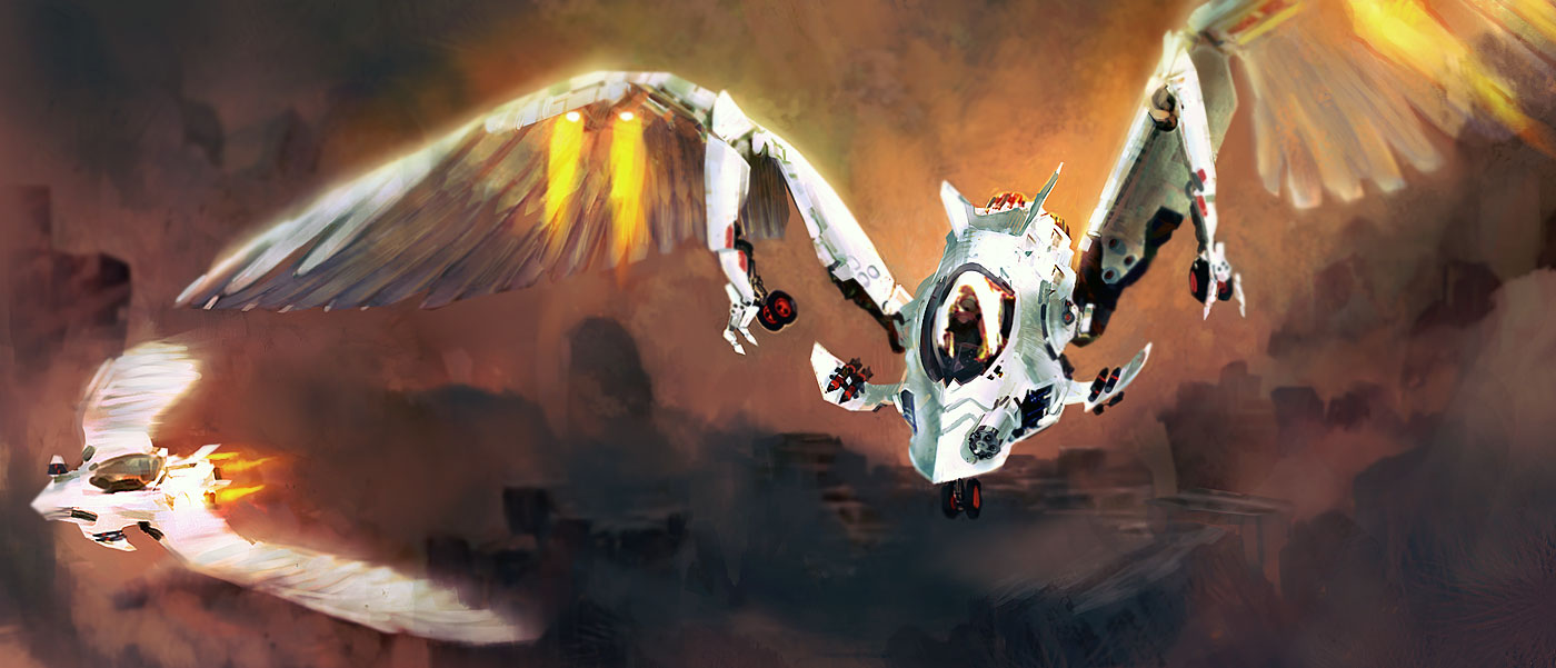
Nice 'thopter:
http://4.bp.blogspot.com/_kJCny-EBxS8/T ... sdkjet.jpg" onclick="window.open(this.href);return false;
http://3.bp.blogspot.com/_kJCny-EBxS8/S ... rthops.jpg" onclick="window.open(this.href);return false;
http://4.bp.blogspot.com/_kJCny-EBxS8/T ... sdkjet.jpg" onclick="window.open(this.href);return false;
http://3.bp.blogspot.com/_kJCny-EBxS8/S ... rthops.jpg" onclick="window.open(this.href);return false;
Paul of Dune was so bad it gave me a seizure that dislocated both of my shoulders and prolapsed my anus.
~Pink Snowman
-
lotek
- Posts: 5784
- Joined: 28 Jul 2009 08:33
Re: Dune Art
the sardaukar one is just perfect imo
it's the first one that fits the mental image I built of them !
it's the first one that fits the mental image I built of them !
Spice is the worm's gonads.
-
SandChigger
- KJASF Ground Zero
- Posts: 14492
- Joined: 08 Feb 2008 22:29
- Location: A continuing state of irritation
- Contact:
Re: Dune Art
Thopter as griffin, in other words?
Nope.
I like the second (Sardaukar) one better than the first, but it doesn't really float my glowglobes.


Nope.
I like the second (Sardaukar) one better than the first, but it doesn't really float my glowglobes.
-
Freakzilla
- Lead Singer and Driver of the Winnebego
- Posts: 18484
- Joined: 05 Feb 2008 01:27
- Location: Atlanta, Georgia, USA
- Contact:
Re: Dune Art
http://fc09.deviantart.net/fs71/f/2011/ ... 3737h3.jpg" onclick="window.open(this.href);return false;

Paul of Dune was so bad it gave me a seizure that dislocated both of my shoulders and prolapsed my anus.
~Pink Snowman
