So... With this return of Arrakeen, I can't help but notice a rather important matter... The only way in which that site is superior to Jacurutu is in appearance. It's much prettier. Now, I'm not saying I like their visual scheme, in fact I think it's pretty lame. Even DamnedNovels looks better than our lame little "phpbb" sign up in the corner. But the way I see it, we're going to see a boom in the online Dune community as more fans take part due to the movie hype. I think we're already seeing lots of newcomers. The question is, what impression are these newcomers going to have of the popular forums out there? I know looks aren't everything, but this is where refining our image might help with PR. Instead of looking gay like Keen, or cliche like DN, I suggest we become the most badass dune site by putting this beauty to work:
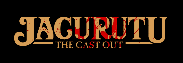
Or, we can use this slight variation I've come up with based on the genius concept by Dunefish:

I also think it would be ideal to put our mandate on the front page, below whatever logo we end up using. Something to the effect of "The True Dune Community." Nothing too specific, but enough to convince newcomers that this is the place to be.
What do you guys think? I know the Dune font isn't ready, but this could be a good start. I love the image of blood on the sand, since it reminds me of the Jacurutu legends, and it also represents the "attitude of the knife" of which we all subscribe to when it comes to which books are canon.


