Page 1 of 9
Dune Font [Finished]
Posted: 19 Oct 2008 17:06
by DuneFishUK
http://dunefont.co.nr/
----
Now I've woken up my attempt to recreate the classic US Dune font I thought I'd start a dedicated thread rather than clogging up the Suggestions board.
I think now I've run out of official letters to copy - Q, X, Y are the only ones left. Apart from that there's a few bits of tinkering to do - to make the letters
look right.
Progress so far:

It seems that the famous font is actually two fonts - one's a bit straighter/more normal than the other. The main diff is in the A:
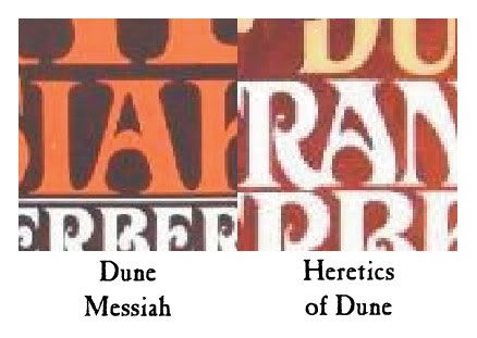
I think I like the curvier A (right) better than the other one.
Crit/comments are welcome: It's still early days, so some fresh eyes looking at this would appreciated!
Posted: 19 Oct 2008 17:28
by DuneFishUK
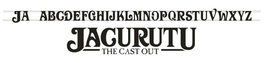
Had a tinker with that logo using the J from one of the Jesus Incident covers:


Posted: 19 Oct 2008 18:05
by Seraphan
Very nice and impressive

Posted: 19 Oct 2008 18:33
by SandChigger
Yeah, looks REALLY good!

I've only halfway been paying attention so far, so sorry if this has been answered, but what kind of font will this be when you're done? TrueType? PostScript?
(Have to confess I don't know all that much about fonts.

)
Posted: 19 Oct 2008 19:00
by Omphalos
I think it looks great, and I agree, the curvy "A" looks better.
Posted: 19 Oct 2008 21:51
by trang
That really is cool, nice work.
Trang
Posted: 19 Oct 2008 22:10
by GamePlayer
Very nice. It looks great. I can't wait to see the final work
Posted: 19 Oct 2008 22:22
by Lisan Al-Gaib
Jacurutu will never be the same with this logo.
I would like to know: How I download fonts and put it in my winword?
Posted: 20 Oct 2008 01:02
by Ampoliros
sweetness!
Re: Dune Font [Work-in-Progress]
Posted: 20 Oct 2008 01:03
by Simon
DuneFishUK wrote:Now I've woken up my attempt to recreate the classic US Dune font I thought I'd start a dedicated thread rather than clogging up the Suggestions board.
I think now I've run out of official letters to copy - Q, X, Y are the only ones left. Apart from that there's a few bits of tinkering to do - to make the letters
look right.
Progress so far:
It seems that the famous font is actually two fonts - one's a bit straighter/more normal than the other. The main diff is in the A:
I think I like the curvier A (right) better than the other one.
Crit/comments are welcome: It's still early days, so some fresh eyes looking at this would appreciated!
I agree, this looks very sharp!

Posted: 20 Oct 2008 01:26
by Omphalos
DuneFishUK wrote:Had a tinker with that logo using the J from one of the Jesus Incident covers:
I like that "The Cast Out" looks kind of pirate-y too. Freak should love that.
Posted: 20 Oct 2008 08:49
by Freakzilla
I do!
I love what you've done with this font, DuneFish and I plan to use it to create a new theme, if you don't mind. I've been keeping my eye's out for a font similar to the one on the books, hopefully this will motivate me to get new artwork done.
Posted: 20 Oct 2008 08:49
by Freakzilla
Lisan Al-Gaib wrote:Jacurutu will never be the same with this logo.
I would like to know: How I download fonts and put it in my winword?
Just put the file in your windows/font/ folder.
Posted: 20 Oct 2008 11:49
by A Thing of Eternity
Very cool.
Posted: 20 Oct 2008 13:25
by Drunken Idaho
Awesome!
Everyone should see my draft version of a possible banner. Keep in mind that I made it using the "VictorianD" font, so that's why the A is totally wrong. You get the idea though.

I am also a fan, however, of the clean black & white look you have above.
Posted: 20 Oct 2008 13:53
by Drunken Idaho
Baraka Bryan wrote:Drunken Idaho wrote:Awesome!
Everyone should see my draft version of a possible banner. Keep in mind that I made it using the "VictorianD" font, so that's why the A is totally wrong. You get the idea though.
I am also a fan, however, of the clean black & white look you have above.
are you able to create the same background effect on the banner made by DuneFish?
Absolutely... But only with his permission. Wouldn't want to step on his toes...
Posted: 20 Oct 2008 14:55
by DuneFishUK
Drunken Idaho wrote:Baraka Bryan wrote:Drunken Idaho wrote:Awesome!
Everyone should see my draft version of a possible banner. Keep in mind that I made it using the "VictorianD" font, so that's why the A is totally wrong. You get the idea though.
I am also a fan, however, of the clean black & white look you have above.
are you able to create the same background effect on the banner made by DuneFish?
Absolutely... But only with his permission. Wouldn't want to step on his toes...
Blatantly! - the black and white is just work-in-progress on the actual font. If you can make it cool then go for it! - looking forward to seeing what you can do (and I've got a couple of random thoughts myself
). atm I'm just doing this for shits, giggles and that I've always wanted to have a go at font making. Freak and co have the final word if they want to use any of it or want to go with something different.
(If you want bigger or vector give us a shout)
I'm hoping to get this all wrapped up as a ttf fairly soon - after that I'll upload it if anyone's interested.

Posted: 20 Oct 2008 14:57
by GamePlayer
DuneFishUK wrote:I'm hoping to get this all wrapped up as a ttf fairly soon - after that I'll upload it if anyone's interested.
I'm very interested...in the FONT (just making that clear)
Posted: 20 Oct 2008 15:02
by Freakzilla
DuneFishUK wrote:Freak and co have the final word if they want to use any of it or want to go with something different.
Oh, I'm going to use the hell out of it here.
Posted: 20 Oct 2008 15:05
by DuneFishUK
Omphalos wrote:DuneFishUK wrote:Had a tinker with that logo using the J from one of the Jesus Incident covers:
I like that "The Cast Out" looks kind of pirate-y too. Freak should love that.
That's a font called
Caslon Antique.. and I think it's my favourite font. I don't know why.. but it's amazing for quotes

:

on Dunefish's fonts
Posted: 20 Oct 2008 16:31
by Sole Man
Its good, but there's just something about the U...
Its look too... Ech Prequelish.
Re: on Dunefish's fonts
Posted: 20 Oct 2008 16:41
by DuneFishUK
Sole Man wrote:Its good, but there's just something about the U...
Its look too... Ech Prequelish.

A preekish U? Can't be having that.. I'll see if I can't have a tinker
Bit of an update - all the letters are basically done!... just some tinkering and node-nudging to do now.
Q and X are brand new - FH never used them in a title
Thoughts welcome...
Re: on Dunefish's fonts
Posted: 20 Oct 2008 17:50
by DuneFishUK
DuneFishUK wrote:...and X are brand new - FH never used them in a title
The Dosadi Experiment....
Ah well... one idea:

Re: on Dunefish's fonts
Posted: 20 Oct 2008 18:15
by Lisan Al-Gaib
DuneFishUK wrote:Sole Man wrote:Its good, but there's just something about the U...
Its look too... Ech Prequelish.
A preekish U? Can't be having that.. I'll see if I can't have a tinker
Bit of an update - all the letters are basically done!... just some tinkering and node-nudging to do now.
Q and X are brand new - FH never used them in a title
Thoughts welcome...
Where I can download this fonts? Are you making it available?
I really like it! I would like to use it on my college homeworks!
Posted: 20 Oct 2008 19:49
by SandChigger
Very nice.
Put me down as interested in the font as well.