Page 5 of 9
Posted: 13 Jan 2009 21:07
by Bijaz
The word from the typographic world is that the font used on the cover is not a specific typeface but something done in house (btw, the same font is used on the cover of Destination Void, too).
Posted: 13 Jan 2009 22:39
by SandChigger
A Thing of Eternity wrote:Someone actually said they
wanted it to be upsidedown?

Suuuurrre.
No, er, well...
Who first brought this up again?
Whoever it was contacted someone (at the publisher, I think) and the word they got back (from the cover designer?) was that the image appears as it was supposed to.
Which either means they indeed did want it to be upside down or ... they're just saying that because they didn't notice the mistake and don't want to admit to it now.
My money's on the latter, FWIW.

Posted: 13 Jan 2009 22:59
by Drunken Idaho
Anyone know where I can see this upside-down dune CoD cover?? I've not heard of such a thing.
Posted: 14 Jan 2009 01:32
by TheDukester
Posted: 14 Jan 2009 01:37
by TheDukester
And here's the image flipped ... note the nice meandering ridge of what is
clearly meant to be a dune.

Posted: 14 Jan 2009 02:41
by SandChigger
Ah ... the bullshit answer over there was even worse than I remembered.
Cropped ... like my arse.

Posted: 14 Jan 2009 10:05
by Freakzilla
I still say it looks like a cooter.
Posted: 14 Jan 2009 11:37
by GamePlayer
I'm not the least bit surprised these people are defending what is blatantly an error. They'd rather look like ignorant fools than admit they are wrong; that has been their MO for quite some time, so this latest embarrassment for them is no shock to me.
Posted: 14 Jan 2009 14:17
by SandRider
Freakzilla wrote:I still say it looks like a cooter.
Dang, son, what kinda cooters you been in ?
Posted: 14 Jan 2009 14:49
by Freakzilla
SandRider wrote:Freakzilla wrote:I still say it looks like a cooter.
Dang, son, what kinda cooters you been in ?
Reminds me of a Pueto Rican Airborne Combat Medic I used to know...

Posted: 14 Jan 2009 15:15
by DuneFishUK
People are idiots. I blame this one on what's happening to creative courses at college and university - ability, both technical ability and the ability to know what you are doing, doesn't count for shit. As long what you're doing is "effective" (aka you
rely on mistakes, you don't have learn from them and you don't even have to achieve what you set out to achieve) you win. Bastards.

</rant>
Bijaz wrote:The word from the typographic world is that the font used on the cover is not a specific typeface but something done in house (btw, the same font is used on the cover of Destination Void, too).
The font appears on amost all of FH's books - the W is from White Plague, the J is from Jesus Incident etc etc... And it's not always the same from book to book. That would make more sense it it was all a bit non-standard/in house.
Posted: 14 Jan 2009 15:33
by Freakzilla
They don't allow too many mistakes in the fire alarm industry.
Mistakes = death.
But we have national codes, standards and certifications to guide us.
Posted: 14 Jan 2009 16:07
by DuneFishUK
My generalising rant was aimed at the current new media/design elbow-holes. Very few graphic designers (etc) ("artists") die from their mistakes... which is a crying shame.
...I'm not actually sure where I was going with this.
Posted: 14 Jan 2009 16:23
by Freakzilla
DuneFishUK wrote:My generalising rant was aimed at the current new media/design elbow-holes. Very few graphic designers (etc) ("artists") die from their mistakes... which is a crying shame.
...I'm not actually sure where I was going with this.
Authors should too.
Posted: 15 Feb 2009 15:56
by DuneFishUK
Alrighty - I think I've worked out how to kern stuff properly in my font software... it only took... however long it took
This is the state of play now - (Not much different to last time, but technically a LOT better.)
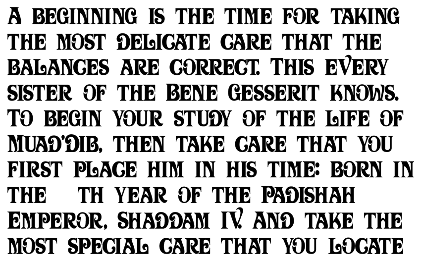
edit: Er yeah - no numbers atm
would be nice though...
Posted: 15 Feb 2009 16:33
by Freakzilla
Beautifull!
Posted: 15 Feb 2009 17:08
by Tleszer
Sweet. Excellent work, DuneFish!
On the font
Posted: 15 Feb 2009 17:32
by Sole Man
So when does this become the logo over here?
Posted: 15 Feb 2009 18:04
by DuneFishUK
I'm pretty much ready to call it a day for now. I'll get it wrapped up as a proper ttf and make a page you can download it from (which is almost done).
Then Freak can crack on with a custom theme.
Although - come to think of it - in the mean time I don't mind customising a handful logo images...
(eg:

)
...for the themes people use most. Freak can then just upload the new versions and make those themes looks a bit more proper.

(oh yeah - and thanks guys

)
Posted: 15 Feb 2009 22:28
by Freakzilla
I've given Simon some direction for some background art, so things are getting closer to a new theme.
Posted: 16 Feb 2009 00:21
by SandChigger
Is he working on that with HIH?
Posted: 16 Feb 2009 07:39
by Freakzilla
I don't know what HIH is.
Posted: 16 Feb 2009 09:23
by inhuien
That's a really nice font. Well done
Posted: 16 Feb 2009 11:31
by SandRider
Freakzilla wrote:I don't know what HIH is.
Her Imperial Highness ....
Posted: 16 Feb 2009 20:30
by Freakzilla
OIC, I haven't discussed anyone else working on it. Anybody who would like to submit artwork for the forum theme is welcome to, of course.