Page 8 of 12
Re: Theme
Posted: 27 Oct 2015 10:01
by lotek
I have it saved on my Pixlr Editor.
Re: Theme
Posted: 27 Oct 2015 10:37
by ᴶᵛᵀᴬ
Freakzilla wrote:He had the Dune Font posted on a web site I think. I'll try to find it tonight.
http://www.kullwahad.com/?p=109

Freakzilla wrote:Can we use that in the theme? Like for titles of forums, that kind of thing?
You can do
everything you want.
Remember just one thing : what makes a good theme ? Balances & harmony.
Every little detail matters but you need to get the whole picture in mind.
That is why I was waiting for precise answers to my questions.
9 criterias, all connected and interdependent. You can't design a good site logo without a colour background in mind ...
❶ colour background
❷ board index margins
❸ logo
❹ site name
❺ right header
❻ board index : columns
❼ subforums : titles/images(?)
❽ subforums : buttons
❾ chatroom
Re: Theme
Posted: 27 Oct 2015 12:46
by Freakzilla
ᴶᵛᵀᴬ wrote:Freakzilla wrote:He had the Dune Font posted on a web site I think. I'll try to find it tonight.
http://www.kullwahad.com/?p=109
Freakzilla wrote:Can we use that in the theme? Like for titles of forums, that kind of thing?
You can do
everything you want.
Remember just one thing : what makes a good theme ? Balances & harmony.
Every little detail matters but you need to get the whole picture in mind.
That is why I was waiting for precise answers to my questions.
9 criterias, all connected and interdependent. You can't design a good site logo without a colour background in mind ...
❶ colour background
❷ board index margins
❸ logo
❹ site name
❺ right header
❻ board index : columns
❼ subforums : titles/images(?)
❽ subforums : buttons
❾ chatroom
I'll try to get to these tonight... pretending to work at the moment.

Re: Theme
Posted: 27 Oct 2015 13:55
by ionah
Freakzilla wrote:Yeah, well we'll do something different so not to piss you off. How's that?
You're so kind sir

I'll be delighted to so see how different it can be.
Re: Theme
Posted: 27 Oct 2015 19:03
by georgiedenbro
ionah wrote:Freakzilla wrote:Yeah, well we'll do something different so not to piss you off. How's that?
You're so kind sir
I'll be delighted to so see how different it can be.
My vote is you do something not-so-different so as to piss him off

There. Now there's no way we can both be satisfied

Re: Theme
Posted: 28 Oct 2015 05:09
by Freakzilla
You people are a test, I swear.

Re: Theme
Posted: 28 Oct 2015 10:38
by ᴶᵛᵀᴬ
ᴶᵛᵀᴬ wrote:
DuneFishUK made the site logo intendedly for Prosilver and its blue header.
That's why you have to make the right choice with the colour background :
ᴶᵛᵀᴬ wrote:
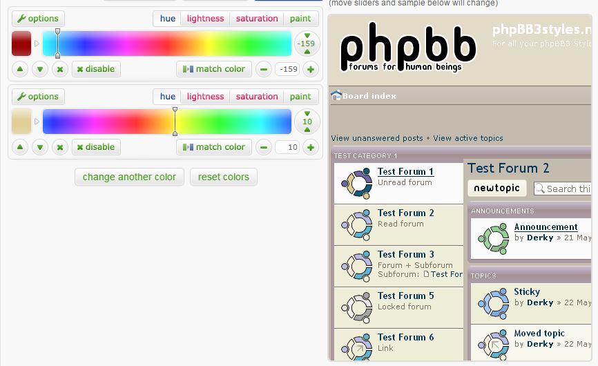
❶ colour background : you can change style's colors with
colorizeIT.com and its two color sliders. For instance :

➤
versions 2, 3 & 4
Version 2, 3 or 4 ?


Something different ?
☞colorizeIT.com
Re: Theme
Posted: 29 Oct 2015 09:59
by lotek
I like the light tone of number 2, very sand like.
Re: Theme
Posted: 29 Oct 2015 11:54
by Freakzilla
Yes, I like the lighter one as well.
Re: Theme
Posted: 29 Oct 2015 13:47
by ᴶᵛᵀᴬ
lotek wrote:I like the light tone of number 2, very sand like.
Freakzilla wrote:Yes, I like the lighter one as well.

I read you loud and clear
-----------------------------------------------------------------------------------------------------
Next ...
❷ board index margins
- option 1 : no margins
- option 2 : medium
- option 3 : large
Re: Theme
Posted: 29 Oct 2015 14:24
by georgiedenbro
Is there such a thing as something halfway between #1 and #2?
Re: Theme
Posted: 29 Oct 2015 15:23
by Omphalos
Narrow. I read this webpage on a monitor turned 90 degrees. Anything wider and it doesn't fit.
Re: Theme
Posted: 29 Oct 2015 19:53
by Freakzilla
I like no margins but I don't really have a preference.
Re: Theme
Posted: 30 Oct 2015 05:07
by Il Barone
Hi everybody
I think you do'nt have to use these awful yellow, orange and brown colors. Even for a tribute to the original dune's graphical work.
If you want to perpetuate the Frank Herbert's legacy, it would be smart to show that it is still current today.
So heres my little contribution to the brainstorm
http://www.colorizeit.com/styles/phpbb- ... h5ul5ts2dO
A little mix between "Ibad blue" and "desert sand".
What do you think about it ?
Re: Theme
Posted: 30 Oct 2015 06:57
by lotek
I like my awful orange, it smells of dirt and ass.
Re: Theme
Posted: 30 Oct 2015 07:51
by Freakzilla
I wouldn't mind seeing some more grey.
The grey rocks towered above him now, made giant by his nearness. As he
listened, he heard birds invisible in that cliff, the soft calling of winged
prey.
Re: Theme
Posted: 30 Oct 2015 09:22
by lotek
How'd you like that?

Still needs a bit of tweaking, especially with the blood top part, but you get the idea.
I used this Dune cover as basis, I dig the grey-ish Ibad eyes.

Re: Theme
Posted: 30 Oct 2015 09:44
by Freakzilla
Fantastic!

Re: Theme
Posted: 30 Oct 2015 10:06
by lotek
Glad you like it
The same with the blood drop darkened.

Maybe smaller sizes need more contrast though.

Re: Theme
Posted: 30 Oct 2015 13:47
by ᴶᵛᵀᴬ
lotek wrote:
Maybe smaller sizes need more contrast though.
Yes, I think so (good job btw
)
Re: Theme
Posted: 31 Oct 2015 12:54
by ᴶᵛᵀᴬ
Logo: some suggestions ...
based on DuneFishUK & Drunken Idaho's creations
darker version
... just my 2 cents
Re: Theme
Posted: 31 Oct 2015 20:40
by Freakzilla
Definitely the darker one. Maybe even a color that contrasts more with the background?
Re: Theme
Posted: 01 Nov 2015 12:40
by ᴶᵛᵀᴬ
Re: Theme
Posted: 02 Nov 2015 07:03
by Freakzilla
ᴶᵛᵀᴬ wrote:pro ubuntu.PNG
The logo looks a little rough around the edges, doesn't it? Sorry to be so picky, maybe we should just go with a solid color?
Re: Theme
Posted: 02 Nov 2015 08:21
by lotek
I'm gonna try to get a better one that fits with the background, although I fear that a over complex banner that looks amazing in full size just doesn't translate well as a logo. But graphic design is not my job, so I'm learning one step at a time.
I could get another version of the existing one without the pixel edges too.
What do you guys think?
Also, is DuneFishUK still around? 'Cause he's way more qualified than I am in this.
(I have a graphic designer friend that might help if he's not too busy, I'll check)
 I read you loud and clear