Page 1 of 2
JoD cover
Posted: 29 Jan 2009 17:37
by DuneFishUK
From Keith's myspace. I do like Youll's work.
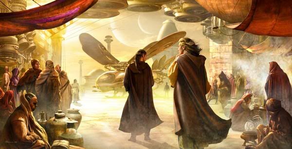
Its a shame that the word DUNE... sorry
DUNE... is going to be bigger than this image.
Posted: 29 Jan 2009 17:55
by EsperandoAGodot
Yeah, his work is pretty great.
I wonder if they could just release an unabridged Dune, illustrated by Youll.
Posted: 29 Jan 2009 17:58
by Frybread
That is a cool piece of artwork. Too bad it or something like it will adorn the next Keith Hackerson book.
Posted: 29 Jan 2009 19:34
by Omphalos
Im fascinated by ornithopters. That is a cool cover.
Posted: 29 Jan 2009 19:59
by Nekhrun
I think it's the most boring one yet. I'm sure he was inspired by the text it will be wrapping.

Posted: 29 Jan 2009 20:03
by A Thing of Eternity
I actually think that guy's art falls flat. It's almost realism, but not far enough from realism to be considered artistic. I honestly think it just looks like someone who can almost do realism...
Posted: 29 Jan 2009 20:22
by SandRider
yeah, the thopter is cool. Too bad it's parked under
the 350Kv high-voltage lines. Tricky take-off.
on the whole, the pic doesn't move me.
I'll agree with Thing : almost realism.
but then, I'm a big fan of Dante Rosetti .....
And Turner & Constable...
Posted: 29 Jan 2009 21:20
by TheDukester
That one does zero for me. I liked the cover for Pauline much more, although I'm fully aware that what it was wrapped around was a bunch of Keith Anderson's Star Wars hiking bullshit.
Posted: 29 Jan 2009 21:20
by SandChigger
Nekhrun wrote:I think it's the most boring one yet. I'm sure he was inspired by the text it will be wrapping.
I think it's an interesting pic, but yeah, as part of the series, definitely unexciting.
And, yes, it is inspired by the text. Kevin's blawg about it is where I got the shit for the "Jessica Inconsistencies" thread yesterday/the day before.
I kinda almost wish they'd gone with Kevin's stupid "Jessica looking longingly out over the footprints disappearing into the desert, wondering what has become of Paul" cover. But I'm sure the relatively boring nature of this one—this is a scene that Youll picked out of the book and chose to depict—says
really good things about the book itself.

Problems with this pic, though:
1. Them two big giant Youll moons. (Can we say TIDAL FORCES THE LIKE OF WHICH EVEN GAWD HAS NOT SEEN? Yes we can!)
2. Ornithopter's wings should be more folded back, no? Obviously going for the insect look.
Posted: 29 Jan 2009 21:23
by TheDukester
This development actually makes me happy, though. A boring cover will mean fewer sales. I'm still convinced that JoD will be a dismal failure; this sort of thing can only help.
Posted: 29 Jan 2009 21:35
by SandChigger
I was just thinking, it's kinda sexist, too, isn't it?
The blinded emperor has walked out into the sands, the world could soon be falling apart and all Hell break lose!
So what do the women do?
GO SHOPPING!

Posted: 30 Jan 2009 05:31
by dunaddict
I don't know why, but I always feel sorry for the artist when they create a visual masterpiece and then the story itself is crap; unworthy of the beautiful picture on the cover. All that work...for what?
It's like a perfectly wrapped christmas present, but when you open it....the present itself is something you didn't want!
Posted: 30 Jan 2009 05:49
by SandChigger
Well, at least there's no longer any question of a doubt that Kevin (and the other guy?) is in contact with and provides the cover artist with "creative" (COUGH COUGH COUGH) input, or that the cover pix come from scenes in the books.
Remember back when the "Seaworms" cover was debuted and Byron gave us a song and dance about how there was no connection?
(Or was it that he didn't know? Hmm...

)
(Btw, dunaddict, what's your avatar from?)
Posted: 30 Jan 2009 06:01
by dunaddict
SandChigger wrote:(Btw, dunaddict, what's your avatar from?)
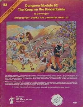
Dutch back cover (hardcover)
Posted: 30 Jan 2009 09:02
by Freakzilla
dunaddict wrote:SandChigger wrote:(Btw, dunaddict, what's your avatar from?)
Dutch back cover (hardcover)
Always with clouds...
Posted: 30 Jan 2009 09:08
by inhuien
Freakzilla wrote:dunaddict wrote:SandChigger wrote:(Btw, dunaddict, what's your avatar from?)
Dutch back cover (hardcover)
Always with clouds...
Dust clouds???
I'll get ma coat....
Posted: 30 Jan 2009 09:13
by Freakzilla
inhuien wrote:Freakzilla wrote:dunaddict wrote:SandChigger wrote:(Btw, dunaddict, what's your avatar from?)
Dutch back cover (hardcover)
Always with clouds...
Dust clouds???
I'll get ma coat....
They look to pretty to me but I guess you could rationalize it that way.
Posted: 30 Jan 2009 10:18
by Mr. Teg
I guess if you like the miniseries...
More like something from a D&D book (contrasted with the artwork from the original series).
Posted: 30 Jan 2009 11:24
by inhuien
Mr. Teg wrote:More like something from a D&D book (contrasted with the artwork from the original series).
Aww come on, it's not that bad.
Posted: 30 Jan 2009 11:46
by GamePlayer
I recall when there was a thread on DN in which we were supposed to say what we liked about the prequel books. The only thing nice thing I had to say about any of the prequel books was praise for the artwork on some of the covers. To my mind, the cover artwork remains the only appealing thing about them

Posted: 30 Jan 2009 12:10
by Freakzilla
He is a pretty good artist. I do like his 'thopter.
SC:
I think they only folded the wings back for fixed-wing take-off, flight probably storage.
The Duke said: "This ship has more power than the others. If we took off
under jet with three-quarter wings, we could crowd in an additional man."
"That sand's soft," Kynes said.
"With four extra men aboard on a jet takeoff, we could snap the wings,
Sire," Halleck said.
"Not on this ship," the Duke said. He hauled back on the controls as the
'thopter glided in beside the crawler. The wings tipped up, braked the 'thopter
to a skidding stop within twenty meters of the factory.
The crawler was silent now, no sand spouting from its vents. Only a faint
mechanical rumble issued from it, becoming more audible as the Duke opened his
door.
Immediately, their nostrils were assailed by the odor of cinnamon--heavy and
pungent.
With a loud flapping, the spotter aircraft glided down to the sand on the
other side of the crawler. The Duke's own escort swooped in to land in line with
him.
I think the interesting thing is that the wings are variable on at least three axis, the angles from the fuselage, waterline and flapping.
Posted: 30 Jan 2009 12:59
by dunaddict
Freakzilla wrote:dunaddict wrote:SandChigger wrote:(Btw, dunaddict, what's your avatar from?)
Dutch back cover (hardcover)
Always with clouds...
Not clouds. A sandstorm. Probably a Coriolis storm. This is the complete image:

Posted: 30 Jan 2009 13:21
by SandChigger
Hell, with those moons coming into alignment it's probably a land tide.
(Nice, though. Thanks for posting the whole thing.
)
Posted: 30 Jan 2009 17:18
by Freakzilla
SandChigger wrote:Hell, with those moons coming into alignment it's probably a land tide.
(Nice, though. Thanks for posting the whole thing.
)
There is mention of "tidal dust basins".
Posted: 30 Jan 2009 20:16
by SandChigger
Yep.
IIRC, when Earth's moon appeared as large as that big one in the pic, the ocean tides were something like a mile high.
(I exaggerate for effect , but two overlarge moons too close to a planet would have significant surface effects.)