----
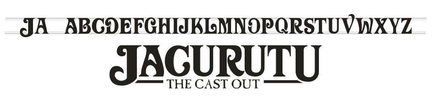
Now I've woken up my attempt to recreate the classic US Dune font I thought I'd start a dedicated thread rather than clogging up the Suggestions board.
I think now I've run out of official letters to copy - Q, X, Y are the only ones left. Apart from that there's a few bits of tinkering to do - to make the letters look right.
Progress so far:

It seems that the famous font is actually two fonts - one's a bit straighter/more normal than the other. The main diff is in the A:
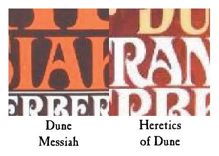
I think I like the curvier A (right) better than the other one.
Crit/comments are welcome: It's still early days, so some fresh eyes looking at this would appreciated!