Page 1 of 3
Board Suggestions
Posted: 15 Oct 2008 09:05
by Drunken Idaho
Just a couple things...
Could it hurt to have some nice graphics and/or a Dunish color scheme? I could make up some graphics for you, like a title banner or whatever. Just let me know what dimensions you need.
Also, It couldn't hurt to have the board not stretch all the way across the width of any given screen. Only reason I say this is because I use a widescreen monitor. I like a nice thin message board. Maybe formatted for 1280x1024 res. That way, it's up to modern standards and looks attractive.
But yeah, let me know if you're interested in some graphics work. I have the classic Dune font on my comp!
Re: Board Suggestions
Posted: 15 Oct 2008 09:13
by Freakzilla
Drunken Idaho wrote:Just a couple things...
Could it hurt to have some nice graphics and/or a Dunish color scheme? I could make up some graphics for you, like a title banner or whatever. Just let me know what dimensions you need.
You can choose alternate themes in your profile. Any new themes you would like to have added will gladly be considered.
Also, It couldn't hurt to have the board not stretch all the way across the width of any given screen. Only reason I say this is because I use a widescreen monitor. I like a nice thin message board. Maybe formatted for 1280x1024 res. That way, it's up to modern standards and looks attractive.
I'm at work looking at my Acer AL1916W 19" widescreen TFT and the forum stretches as wide as the window.
But yeah, let me know if you're interested in some graphics work. I have the classic Dune font on my comp!
I've very much like to see that font.
Re: Board Suggestions
Posted: 15 Oct 2008 10:00
by Drunken Idaho
Freakzilla wrote:
You can choose alternate themes in your profile. Any new themes you would like to have added will gladly be considered.
Wow. Didn't even realize that. I guess that's because most of the boards I've ever posted on only provide one or two lame variations. Cool!
Freakzilla wrote:
Also, It couldn't hurt to have the board not stretch all the way across the width of any given screen. Only reason I say this is because I use a widescreen monitor. I like a nice thin message board. Maybe formatted for 1280x1024 res. That way, it's up to modern standards and looks attractive.
I'm at work looking at my Acer AL1916W 19" widescreen TFT and the forum stretches as wide as the window.
That's the problem. It's just too wide for my taste. Any way we could make that an adjustable setting?
Freakzilla wrote:
But yeah, let me know if you're interested in some graphics work. I have the classic Dune font on my comp!
I've very much like to see that font.
It's called VictorianD and it looks like this:


Re: Board Suggestions
Posted: 15 Oct 2008 10:35
by Freakzilla
Drunken Idaho wrote:Freakzilla wrote:
You can choose alternate themes in your profile. Any new themes you would like to have added will gladly be considered.
Wow. Didn't even realize that. I guess that's because most of the boards I've ever posted on only provide one or two lame variations. Cool!
I've been meaning to make an original one but I've never done it before so I'm kind of hesitant. I will eventually though.
Freakzilla wrote:
Also, It couldn't hurt to have the board not stretch all the way across the width of any given screen. Only reason I say this is because I use a widescreen monitor. I like a nice thin message board. Maybe formatted for 1280x1024 res. That way, it's up to modern standards and looks attractive.
I'm at work looking at my Acer AL1916W 19" widescreen TFT and the forum stretches as wide as the window.
That's the problem. It's just too wide for my taste. Any way we could make that an adjustable setting?
I believe that's dependant on the theme. There may be one in the list that doesn't stretch, but I doubt it because I chose them and I like them stretchy. Like I said, if you find one you like I'll upload it.
Freakzilla wrote:
But yeah, let me know if you're interested in some graphics work. I have the classic Dune font on my comp!
I've very much like to see that font.
It's called VictorianD and it looks like this:
That does look very close to the font that was on the old paperbacks and the DE. I'd use it.
Re: Board Suggestions
Posted: 15 Oct 2008 10:49
by Drunken Idaho
Freakzilla wrote:
That does look very close to the font that was on the old paperbacks and the DE. I'd use it.
Yeah, well the way I figure it, graphic designers had various popular type-faces to utilize, as opposed to set digital fonts. This gave them the ability to make minor adjustments to the letters, which is probably why the book covers vary slightly from this font.
But anyway, feel free to use this image, or let me know if you want something specific. I don't mind helping out.
Posted: 15 Oct 2008 11:12
by Freakzilla
Posted: 15 Oct 2008 11:35
by Freakzilla
I've been looking for a font like that for a long time, thanks DD.
Posted: 15 Oct 2008 12:11
by Drunken Idaho
Not a problem
Posted: 15 Oct 2008 15:45
by DuneFishUK
Great find DD - I don't think I've seen that one before! (I like fonts)
I do like the font on the old US editions and ages ago I had a try at making it as a font. I got most of the letters traced out, but then managed to loose interest... I'm still meaning to dust it off and finish it one day.
I do however have the letters A, C, U, R and T in vector form - if I then steal the J from DD's font and...

A bit rough around the edges (the U looks off) .. but you get the idea

Posted: 15 Oct 2008 15:48
by Freakzilla
DuneFishUK wrote:Great find DD - I don't think I've seen that one before! (I like fonts)
I do like the font on the old US editions and ages ago I had a try at making it as a font. I got most of the letters traced out, but then managed to loose interest... I'm still meaning to dust it off and finish it one day.
I do however have the letters A, C, U, R and T in vector form - if I then steal the J from DD's font and...
A bit rough around the edges (the U looks off) .. but you get the idea
That's great!
Posted: 15 Oct 2008 15:52
by A Thing of Eternity
That is getting really damned close. The U's do have a tiny bit too much flare at the tops, but are pretty close otherwise.
We could steal the J from the Jesus Incident cover, it's in the oldschool Dune font. EDIT: That said, I think the current J is cooler than the one in the real Dune font.
Posted: 15 Oct 2008 16:04
by Freakzilla
I'll probably end up using the VictorianD unless some makes a Dune font because I'll want to use it a lot on a new theme.
Anyone got a pro font editor?
Posted: 15 Oct 2008 16:18
by DuneFishUK
A Thing of Eternity wrote:That is getting really damned close. The U's do have a tiny bit too much flare at the tops, but are pretty close otherwise.
We could steal the J from the Jesus Incident cover, it's in the oldschool Dune font. EDIT: That said, I think the current J is cooler than the one in the real Dune font.
That might be it - luckily Us are pretty widely used on Dune books

Good idea! - I forgot there were other books with the same font. Some have got some nice big letters on them.
Posted: 15 Oct 2008 16:24
by Freakzilla
That's got to be a real font, I wonder if anyone at the publisher would know?
Posted: 15 Oct 2008 16:29
by A Thing of Eternity
Freakzilla wrote:That's got to be a real font, I wonder if anyone at the publisher would know?
The font may have simpy never been inputted into a computer. I think when the last of the books that used this font came out (Man of Two worlds or Ascention Factor) the publishers probably weren't switched to computers yet. The publisher ACE might be a good place to start looking though.
Posted: 15 Oct 2008 16:44
by Omphalos
DuneFishUK wrote:Great find DD - I don't think I've seen that one before! (I like fonts)
I do like the font on the old US editions and ages ago I had a try at making it as a font. I got most of the letters traced out, but then managed to loose interest... I'm still meaning to dust it off and finish it one day.
I do however have the letters A, C, U, R and T in vector form - if I then steal the J from DD's font and...
A bit rough around the edges (the U looks off) .. but you get the idea
That looks awesome (cant see Drunken's here at work). I think it might look better if the last U were lower too, like the J.
Re: Board Suggestions
Posted: 15 Oct 2008 16:47
by chanilover
Drunken Idaho wrote:Freakzilla wrote:
You can choose alternate themes in your profile. Any new themes you would like to have added will gladly be considered.
Wow. Didn't even realize that. I guess that's because most of the boards I've ever posted on only provide one or two lame variations. Cool!
Freakzilla wrote:
Also, It couldn't hurt to have the board not stretch all the way across the width of any given screen. Only reason I say this is because I use a widescreen monitor. I like a nice thin message board. Maybe formatted for 1280x1024 res. That way, it's up to modern standards and looks attractive.
I'm at work looking at my Acer AL1916W 19" widescreen TFT and the forum stretches as wide as the window.
That's the problem. It's just too wide for my taste. Any way we could make that an adjustable setting?
Freakzilla wrote:
But yeah, let me know if you're interested in some graphics work. I have the classic Dune font on my comp!
I've very much like to see that font.
It's called VictorianD and it looks like this:
I like that banner, it looks great.
By the way, congratulations. This forum now comes up first on a Google search for Jacurutu. It still doesn't come up when you search "Dune forums", though.
Re: Board Suggestions
Posted: 15 Oct 2008 16:59
by Freakzilla
chanilover wrote:By the way, congratulations. This forum now comes up first on a Google search for Jacurutu. It still doesn't come up when you search "Dune forums", though.
That's awesome, I've got to do something to get higher on the list of Dune searches.
Honestly though, I need to spruce the place up before the public starts showing up for free beer.
Posted: 15 Oct 2008 17:29
by Freakzilla
I emailed the Penguin Group (Berkley) and they sent me an automated response saying they would get back to me.
http://penguingroup.custhelp.com/cgi-bi ... 1224107209
Posted: 16 Oct 2008 17:01
by DuneFishUK
Nice one - keep us posted.
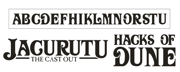
I've been autocadding all day at work so playing with nodes and lines at home isn't high on my list.. so only had a quick cock about with my font. This is the total work so far....
(had a go at what Omph said as well as a quick look at how it goes together
)
Posted: 16 Oct 2008 17:16
by Freakzilla
Looks pretty damned good!
Posted: 16 Oct 2008 17:51
by A Thing of Eternity
Very nice thus far.
Posted: 16 Oct 2008 17:58
by TheDukester
Hacks of Dune. Priceless.
Posted: 16 Oct 2008 18:33
by GamePlayer
Thank you for the link to that font. They come in really handy.
Posted: 16 Oct 2008 21:27
by Tleszer
Impressive work.